
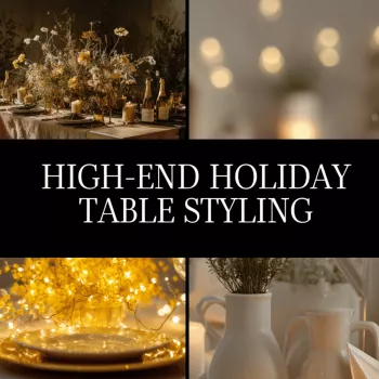
A polished holiday table comes from a clear visual direction, deliberate layering, and disciplined finishing touches. This guide walks through a high-end approach to building an elegant Christmas tablescape—from concept and AI-assisted mood boards to luxury place settings, centerpiece proportions, lighting, and a final checklist for a cohesive, camera-ready result.
The most elevated tablescapes feel edited—like every piece belongs. Start by choosing one defining element to lead the story: a metallic finish, a botanical choice, a signature color, or a statement charger. Then limit the palette to 2–3 core colors plus one metal so materials (linen, crystal, lacquer, glass) can do the heavy lifting.
Write the mood in one line—classic estate, winter white, modern black-tie, old-world gold, alpine lodge—and use it to accept or reject every item. Finally, select a visual “anchor” detail you can repeat (ribbon tone, napkin fold, candle-height family, or a floral ingredient) to keep the table cohesive.
| Style direction | Palette + metals | Hero materials | Repeat this detail |
|---|---|---|---|
| Classic estate | Ivory, deep green, gold | Damask or fine linen, crystal stemware | Gold rim or gold taper holders |
| Winter white | White, silver, clear glass | Textured linen, snowy florals, mirrored accents | Same candle height family (short/medium/tall) |
| Modern black-tie | Black, white, champagne gold | Matte black dinnerware, sleek flatware | A single clean napkin fold + minimal greenery |
| Old-world luxe | Burgundy, cream, antique gold | Velvet ribbon, heirloom brass | Burgundy accent (menu, napkin, or floral) |
| Alpine lodge elevated | Forest green, red-brown, brass | Wood chargers, evergreen, warm candlelight | Natural texture (wood + linen) at every setting |
A mood board is most useful when it prevents “almost-right” purchases. Collect 10–15 references that share the same lighting style (warm candlelight vs. bright daylight), because mixed lighting cues create mixed decisions. Then create two boards:
Lock proportions early. Measure the table length, choose a runner width, set a centerpiece height limit so guests can see each other, and define the place-setting “footprint” so stemware and flatware don’t crowd the plate. The best board also sets boundaries: a short “do not buy” list (extra colors, competing patterns, novelty décor) that breaks the luxury tone.
Start with the largest surface. A full tablecloth reads most formal; a runner over a bare table reads modern and editorial. From there, use chargers to set the scale and elevate the silhouette—especially when the table is long or the room is open-concept and you need visual presence.
Keep the relationship between charger and plate intentional: if the charger is ornate, let the dinner plate stay simple; if the dinner plate has a strong rim or pattern, choose a calmer charger. Aim for consistent rim profiles across plates and bowls for a curated look, and mix only one “statement” shape at a time.
For cut-flower longevity, conditioning basics matter as much as styling; the Royal Horticultural Society’s guidance on cut flower care is a reliable reference: https://www.rhs.org.uk/plants/types/cut-flowers/conditioning.
If you want a quick check on classic place-setting order before you finalize spacing, Emily Post’s table setting guidelines are a helpful baseline: https://emilypost.com/advice/table-settings.
For additional entertaining inspiration (especially if you’re comparing classic vs. modern arrangements), browse Martha Stewart’s table setting ideas: https://www.marthastewart.com/275665/table-setting-ideas.
If you want a more structured way to move from inspiration to a cohesive, high-end result, a guided plan keeps decisions consistent across palette, materials, and scale. The High-End Holiday Table Styling | Elegant Christmas Tablescape Guide | Luxury Tablesetting eBook | AI Mood Board Tips & Checklist is built around that workflow—so the table feels intentional from the first reference image to the final candlelight.
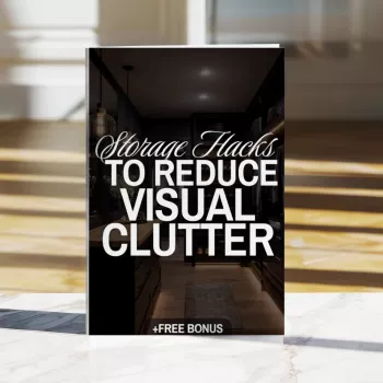
To keep the room itself feeling as elevated as the table, decluttering support helps, especially in dining areas that collect “extras.” Pair your styling plan with the Storage Hacks to Reduce Visual Clutter | Printable Checklist for Home Organization, Decluttering Guide & Minimalist Storage Ideas (Digital Download) so surfaces stay calm and the tablescape remains the focal point.
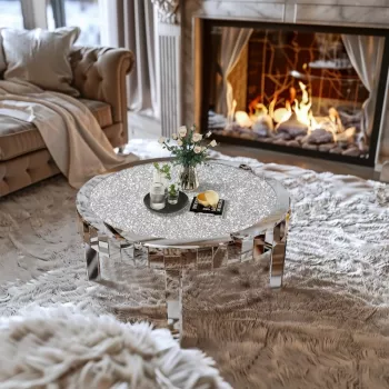
And if you’re setting up a pre-dinner cocktail moment, a reflective surface can amplify candlelight and glassware without adding more décor—consider the Elegant Mirrored Coffee Table with Crystal Inlay as a complementary piece that carries the same “shine and glow” story into the living space.
Stick to 2–3 core colors plus one metal finish for the most cohesive look. Keep patterns minimal, then repeat one small accent (like a ribbon tone or napkin fold) across every place setting.
Use the “very low or clearly above eye line” rule so conversation stays easy. Clusters of low arrangements with candles often look more high-end than a single mid-height centerpiece that blocks sightlines.
They help you commit to one palette and material direction early, so purchases match each other and the room’s lighting. A feeling board sets the atmosphere, while a shopping board locks in specific items and proportions before you buy.


Leave a comment